7 Best Locations to Find + Convert More Subscribers on Your Blog
/Your blog is ripe for building connections and growing an eager audience interested in hearing from YOU. Whether you get floods of traffic, receive only a trickle, or you haven’t even started a mailing list yet, it’s never too late to find new subscribers.
As I run through the areas of your website where you can connect with people directly (and invite them to subscribe), I’m sharing lots of great examples by other inspirational businesswomen.
By the end of this post, your head will be buzzing with freebie ideas!
The 7 top places on your website to encourage subscribers to sign up (+ examples)
Hold-up!
Before we dig into these seven hotspots, I cannot stress enough how important it is that you offer a lead magnet (a.k.a freebie) on your blog instead of asking people to “Subscribe for updates”.
Yes, there are creative & vibrant ways to invite people to your newsletter, but when you create on-point freebies, the difference in conversions will speak for itself! In fact, I wrote a whole post on the 5 reasons why you need to create lead magnets.
Let’s get to it.
1 | Put your sidebar to work with a short + tantalizing opt-in
Whether you put it on the left or right, your sidebar is prime real estate when it comes to building your email list.
Rather than a boring “Sign up for updates” message, make it worth your potential subscriber’s time and offer them your signature lead magnet.
It doesn’t take long to create a tempting visual – an image that can link to your LeadPages* lead box or landing page, or that simply sits above your opt-in form.

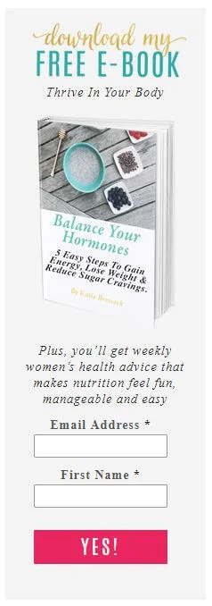
Check my clients’ sidebar opt-in forms above – with both Dr. Danielle Dowling (left) and Katie Bressack (right), they don’t just show the cover image of their freebies, but they have some really compelling copy too.
Below, you’ll find Claire Pelletreau (left) and me (right) giving our signature free offerings in our sidebars. Like my clients’ ones above, the freebies are designed to help qualify ideal subscribers, to get the right people on our mailing lists – people who’ll benefit most from what we have to offer.
You’ll see this specificity repeated in the examples in this post.
Create a lead magnet which solves a very specific problem to get the right people on your mailing list.


2 | Turn your website header into a bold, friendly call-to-action

Nielsen Norman Group, a leading voice in user experience, found “web users spend 80% of their time looking at information above the page fold”.
In an analysis of 57,453 eye-tracking fixations, they found that there was a dramatic drop-off in user attention at the position of the page fold.
This is the reason you’re seeing so many blogs with big, bold headers encouraging sign-ups. Some, which fill the space completely, are called “welcome mats”, while other “header banners” often has a photo of the founder. Always presented on the homepage, some sites have themes which enable site-wide availability.
This headline placement is a great spot to introduce who you are with a self-portrait, what you stand for and why I should join your mailing list.
I use Sumo’s free apps, including their Heat Map – check out their guide.
Here are some fantastic header opt-ins…
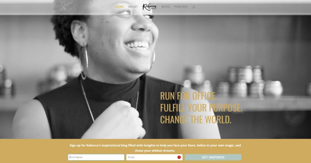
Rebecca Thompson, helps women run for office. Rebecca keeps her powerful mission message simple, and her portrait gives you an idea of her approachable enthusiasm.
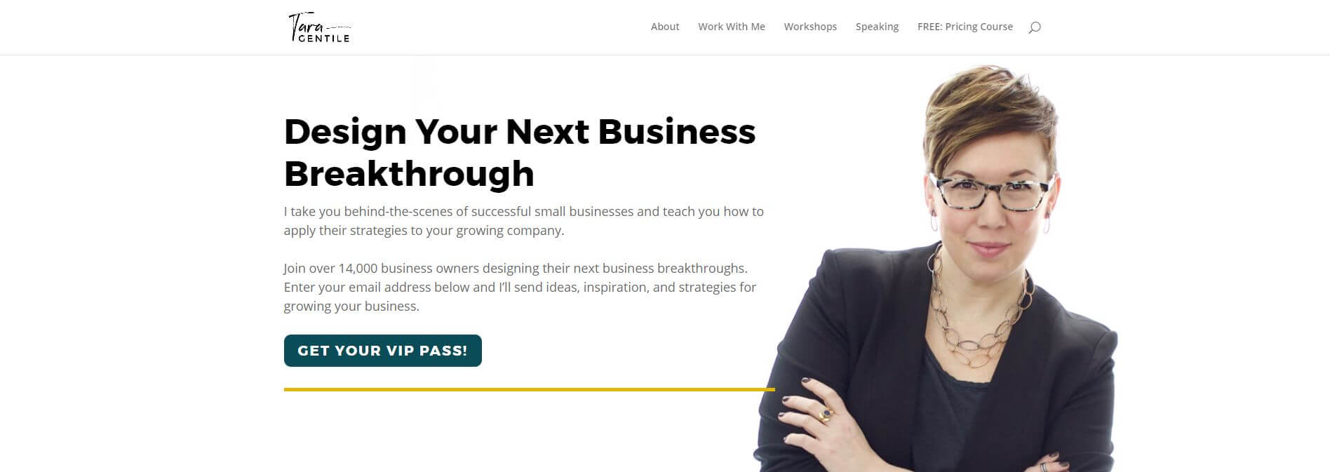
Tara Gentile, Founder of CoCommercial and the podcast, Profit. Power.

Jill and Josh Stanton help people quit their jobs & build online businesses. Their energy as a couple is vital to their brand.
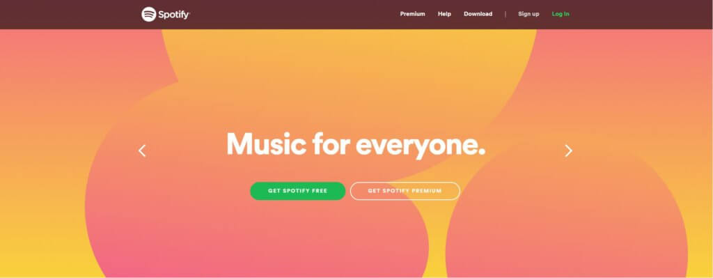
I wanted to include a huge international company, like Spotify, to show how even the big brands are using these tools effectively.
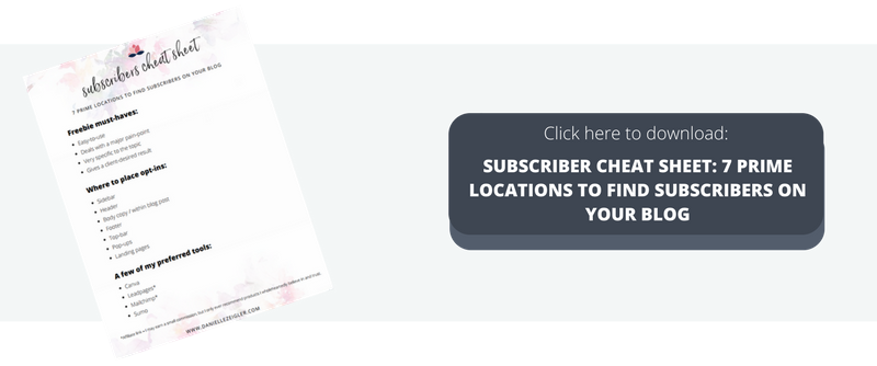
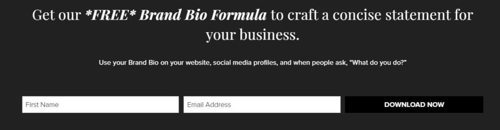
psst... don't miss my top 4 tools + top freebie must-haves in the Subscribers Cheat Sheet. Download here:
3 | Break up body copy with a free offer that’s related to your blog post content
I’ve already laid down the bad news that users spend 80% on average above “the fold”.
But, if they’re interested enough, they WILL scroll down.
What I’m about to tell you may well sound like it contradicts #1, however, it’s not all bad and this gives you even more space to maximize sign-up opportunities.
“Web users spend 80% of their time viewing the left half of the page and 20% viewing the right half.” – Nielsen Norman Group
That’s still 20%, so go ahead and use your right-hand sidebar. :)
Eyetracking research shows people read web content in the F-pattern.
Eyetracking is decades old and related to how we read in the West.
You can now use this knowledge to improve your user experience – YES!
A wall of text is exhausting on the eyes, so break up your content with sub-headings, bullets, images and… subscriber callouts.
That doesn’t mean pack in 20 callout lead boxes into every post. In fact, don’t go overboard – having one every 500 – 1000 words, or even just one at the end of your post, before the comments can work. Less is more impactful, in this case. Especially if you’re utilizing all 7 prime locations (and you should!).
Onto the examples…

On their Resources page, Abagail and Emylee, Co-founders of Think Creative Collective, present their free resource guide as the lead offer on this page.

on the Female Entrepreneur Association, each podcast blog post comes with a generous giveaway contest for her guests’ paid programs, in return for comments – a novel approach (one that requires a huge following, like Carrie has).

I Am That Girl, a non-profit co-founded by Emily Greener and Alexis Jones, empowers over 1 million young women across the globe through leadership, social and personal development. They break up their homepage with options appealing precisely to their target market
Lastly, above is my own example of extra content, which provides added value for my blog post 14 Easy Ways to Drive Traffic to a (New) Blog. (This example is clickable, if you'd like the real opt-in!)
It’s fairly easy to take your post topic and add a downloadable lead magnet. You don’t have to do it for every post, but the options are limitless, for example, you could:
Expand on the post and add extra tips
Condense it into a handy checklist
Make an accompanying cheat sheet
Create a workbook to guide subscribers through the problem
And many more ideas!
4 | Make better use of your footer by adding a short sign-up form
Sourcing subscribers often get forgotten on your website footer, but plenty of people DO make it down there! So, what are they left with? Give them a reason to stay in touch, e.g.…
Promise Tangeman and her powerhouse of women designers and strategists who make up the Go Live team keep their footer styled & direct.

Tanya Geisler, a leadership coach, keeps her is all about squashing/releasing/dealing with the imposter complex and offers a video series to help you get to know her personality, voice & style while you learn to lead. I like how she breaks out of the mold with her unorthodox button text!

A Life More Inspired Founder, Nicola Rae-Wickham, brings in her feelings of light and positivity + a nod to relaxation with the palm tree print background in her website footer.
5 | Add a discreet top-bar to capture leads on mobile
Whether you’re persuaded by the header/welcome mat or the thought of you on your homepage freaks you out, using a top-bar opt-in form, is the easiest and one of the most discreet options.
If you have a menu which scrolls with your website users, like I do, then it also stays with each user as they browse your site.
I use Hello Bar – it’s free, super-easy to use, and synchs with Aweber, Campaign Monitor and, my chosen email marketing provider, MailChimp*.
The examples below are from (top-bottom) One Woman Shop, Jam, moi, & Geisler.


6 | Have a persuasive pop-up – they’re not as annoying as you think!
Sumo (like many other marketing companies in this niche) have convincing statistics showing that pop-ups work incredibly well.
But there are ways to pop up gracefully!
You can have settings on your pop-ups which means they’re triggered:
Only on exit-intent (when a user makes a break to close the tab)
After a certain amount of time, e.g. 20 seconds
On reaching the end of an article/page
But, it’s important to bear in mind that Google will soon start penalizing adverts on mobile phones which cover the whole screen – and pop-ups come under that banner. But providers will, in time, follow suit and give you the option to only show them on larger devices.
Want to see some tasteful pop-ups?

Haute Stock* keep things super-chic and minimal + the freebie offer is on-point.

Danielle LaPorte lays on the passion with her bold use of color, trademark font and welcoming content.

Sarah Von Bargen of Yes and Yes shows you how many other like-minded people have already signed up + a taster of what’s on offer.

Instead of a weekly newsletter, Ashley Beaudin – #theimperfectboss movement maker, is offering heartfelt letters every Sunday. Stellar copy here. Don’t mistake this opt-in as “updates” – these are letters only for subscribers which match the tone of the movement: honest storytelling.
As you can see, the above businesswomen matched their pop-up tone of voice & style to their brand. If your blog is full of snark, cheek, or humor, go with that. At the end of the day, testing different pop-ups will give you a good idea what your audience prefers.
7 | Create a landing page to “sell” your signature freebie (aka lead magnet)
Landing pages are an essential tool in your drive to find subscribers who are the right fit for your business.
They are pages without any distraction. There are two options: sign-up or leave.
While this may seem harsh, having things like menus and links to other web pages only serve to dilute and distract people from the main objective.
Think about it:
Attract more ideal subscribers & repel non-ideal ones (with specific, on message lead magnets & effective landing pages).
The amazingly user-friendly LeadPages* can host your landing pages for you, but you can also link your domain so that the web address is on your site instead.
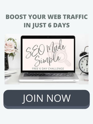
I’ve packed a whole heap of examples into this blog, so I’ve just got one more for you before I wrap up. SEO Made Simple is my signature lead magnet and the page was even featured on LeadPages’ blog in one of their Top 10s!

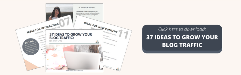
Get my top freebie must-haves & tools in the Subscribers Cheat Sheet.
Disclaimer: *Affiliate link = I may earn a small commission, but I only ever recommend products I wholeheartedly believe in and trust.
So those are the 7 prime locations to find and convert more subscribers on your blog (with 26 examples!).
Are you brimming over with freebie ideas?
Do you already have a lead magnet on your site – how’s it been performing?
Where have you been “bleeding” potential subscribers?
Let’s chat all about lead magnets in the comments below.